一、宽度和像素密度:
(1)首先你我们需要了解iPhone的各个尺寸:iphone 4s 3.5Screen、iphone 5 4Screen、iphone 6 4.7Screen、iphone 6 Plus 5.5 Screen
这个刚开始的时候对布局规划不是很好,没有考虑到兼容什么的,导致到最后浪费了好些时间(一般初学者都会忽略这些屏幕适配的问题)。
具体:var DimenSions=require('Dimensions');
var windowSize=Dimensions.get('window')
<View style={{width:windowSize.width,height:windowSize.height}}>
<Text>....</Text>
</View>
二、Flex的简单布局
(1)flex布局定义?
flex布局是flexible box 的缩写,意为"弹性布局",用来为盒状模型提供最大的灵活性。
(2)适用条件:任何一个容器都可以指定为flex布局(比如你要做一个表格,那么就需要均等分配,这个时候你就可以使用flex布局)。
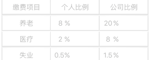
View style={styles.border1}> <View style={{flexDirection:'row',flex1,borderColor:'#e7e7e7',borderWidth:1}}> <View style={{flex:1, justifyContent:'center', alignItems:'center',borderColor:'#e7e7e7',borderWidth:1}}> <Text style={styles.color1}>缴费项目</Text> </View> <View style={{flex:1, justifyContent:'center', alignItems:'center',borderColor:'#e7e7e7',borderWidth:1}}> <Text style={styles.color1}>个人比例</Text> </View> <View style={{flex:1, justifyContent:'center', alignItems:'center',borderColor:'#e7e7e7',borderWidth:1}}> <Text style={styles.color1}>公司比例</Text> </View> </View>
(3)flex中子布局与父布局的关系:子布局依赖与父布局 |
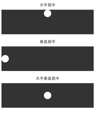
三、水平与垂直居中(alignItems、justifyContent)
<Text style={[styles.text, styles.header]}>
水平居中
</Text>
<View style={{height: 100, backgroundColor: '#333333', alignItems: 'center'}}>
<View style={{backgroundColor: '#fefefe', width: 30, height: 30, borderRadius: 15}}/>
</View>
<Text style={[styles.text, styles.header]}>
垂直居中
</Text>
<View style={{height: 100, backgroundColor: '#333333', justifyContent: 'center'}}>
<View style={{backgroundColor: '#fefefe', width: 30, height: 30, borderRadius: 15}}/>
</View>
<Text style={[styles.text, styles.header]}>
水平垂直居中
</Text>
<View style={{height: 100, backgroundColor: '#333333', alignItems: 'center', justifyContent: 'center'}}>
<View style={{backgroundColor: '#fefefe', width: 30, height: 30, borderRadius: 15}}/>
</View>
四、图片布局:
|
图片布局有一个stretchMode.通过Image.resizeMode进行访问 var keys=Objec.keys(Image.resizeMode).join(''); 使用图片资源的两种方式 (1)使用本地的资源 <Image source={require('./my-icon.png')}> 但是有人也这样写 <Image source={require(images!my-icon.png)}>两者都可以。 (2)使用网络图片 <Image source={{uri:'图片的链接地址'}}> 可以通过设置图片的Style属性来对图片进行设置 var style=StyleSheet.create({ width: height: flex: }) |
五、padding和margin
padding的语法结构:padding:10 , paddingLeft,paddingTop
margin的语法跟Padding一样;marginLeft:10,marginRight:10,marginTop
我们很多时候都在纠结于到底是用margin还是Padding,这两者之间有有什么区别:
1.padding 是属性定义的元素边框与元素之间的控件(指的是内边距)
2.margin指的是外边距
example:
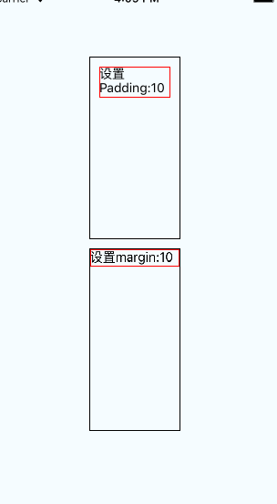
(1)分别在文本上设置margin:10和padding:10:
|
<View style={styles.container}> <View style={{width:100,height:200,borderColor:'black',borderWidth:1}}> <Text style={{padding:10,borderColor:'red',borderWidth:1}}>设置Padding:10 </Text> </View> <View style={{width:100,height:200,borderColor:'black',borderWidth:1}}> <Text style={{margin:10,borderColor:'red',borderWidth:1}}>设置margin:10 </Text> </View> </View>
|
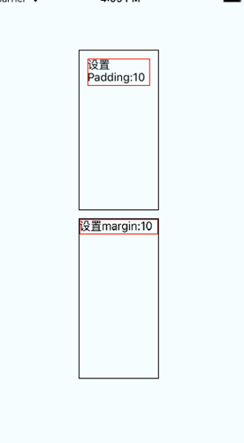
(2)分别在View上设置margin:10和padding:10
<View style={styles.container}>
<View style={{padding:10,width:100,height:200,borderColor:'black',borderWidth:1}}>
<Text style={{borderColor:'red',borderWidth:1}}>设置Padding:10 </Text>
</View>
<View style={{margin:10,width:100,height:200,borderColor:'black',borderWidth:1}}>
<Text style={{borderColor:'red',borderWidth:1}}>设置margin:10 </Text>
</View>
</View>